

“What separates an app that struggles to generate revenue from one that brings in millions of dollars a month?” While product quality is undoubtedly crucial, the final gatekeeper to revenue is often the paywall.
As one of the co-founders of ScreensDesign, I've seen thousands of paywall designs. To understand what works, I analyzed the paywalls and user flows of numerous apps that are crushing it — we're talking about those with revenues in the millions. These aren't just random designs; they are powerful, psychologically-driven patterns that consistently nudge users toward making a purchase.
Here are the 5 most common and effective paywall patterns I discovered. Think of them less as strict rules and more as proven ideas you can test for your own app.
Pattern 1: The anchor & decoy
This pattern is about making the desired option (usually the annual plan) seem like an overwhelmingly good deal by framing it against a less attractive one.
The psychology
This leverages the Anchoring Bias. The first price a user sees (often the higher monthly price) sets their perception of value—this is the "anchor." When they then see the much lower per-month cost of the annual plan, it feels like a massive discount, even if it's still a significant purchase. The less attractive option acts as a "decoy" to make the target option look better.
The strategy
Price the monthly plan high. This isn't designed to sell; it's designed to make the annual plan look good.
Visually emphasize the annual plan. Make it larger, give it a colored border, or add a "Best Value" / "Most Popular" banner. It's like they're telling you which one to pick.
Show the savings. Clearly state the percentage saved (e.g., "Save 85%") or show the effective monthly price for the annual plan right next to the actual monthly/weekly price.
Apps using this pattern

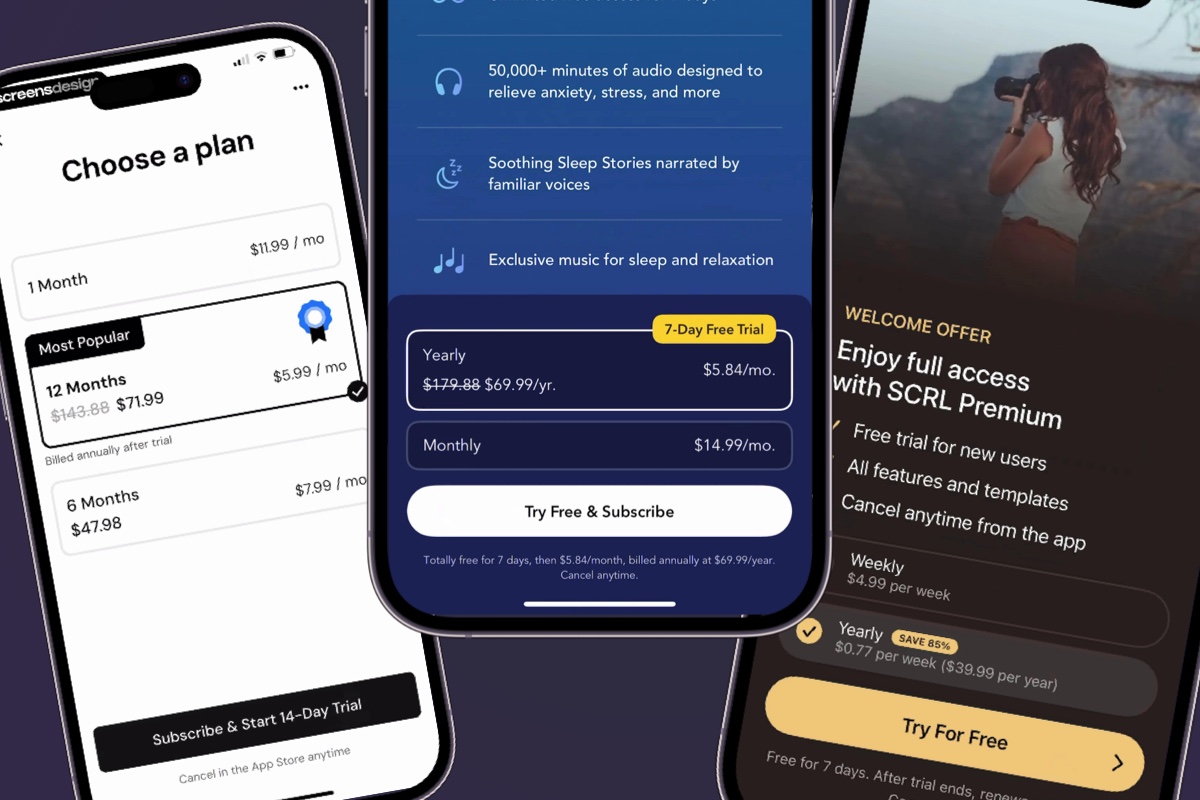
MacroFactor (Monthly Revenue: $2.3M | Monthly Installs: 150k): Uses a "Most Popular" banner to visually guide users to the 12-month plan, framing it as the best choice against the more expensive monthly options.
Calm (Monthly Revenue: $4M | Monthly Installs: 300k): Anchors the user with a high monthly price, making the yearly plan's lower effective monthly cost appear far more attractive.
SCRL (Monthly Revenue: $2M | Monthly Installs: 600k): Highlights a massive "SAVE 85%" on its yearly plan, making the weekly price seem insignificant by comparison.
Potential Testing
A/B Test the Banner: Test the copy on your annual plan banner: "Best Value" vs. "Most Popular" vs. "Save N%".
A/B Test the Emphasis: Test which plan you highlight. Does emphasizing the annual plan always win, or would a lifetime plan convert better for your audience?
A/B Test the Price Display: Test showing the total annual price vs. the effective monthly price (e.g., "59.99/year" vs. "4.99/month").
Pattern 2: The value stack
Instead of just asking for a purchase, this pattern meticulously lists all the concrete benefits and features the user will unlock. They "stack" the value high to make the cost seem insignificant in comparison.
The psychology
This overcomes the pain of payment and loss aversion. By framing the purchase as a gain of many specific features (e.g., "Unlock 500+ workouts," "Remove all ads," "Track your progress"), it makes the user feel they are getting a bargain and would be "losing out" by not subscribing.
The strategy
Use a bulleted list. This makes the benefits scannable and digestible.
Use icons next to each benefit. Visuals are processed faster than text and make the list look more professional and feature-rich.
Use action-oriented language. Start each point with a verb like "Unlock," "Access," "Get," "Remove," or "Enjoy."
Apps using this pattern
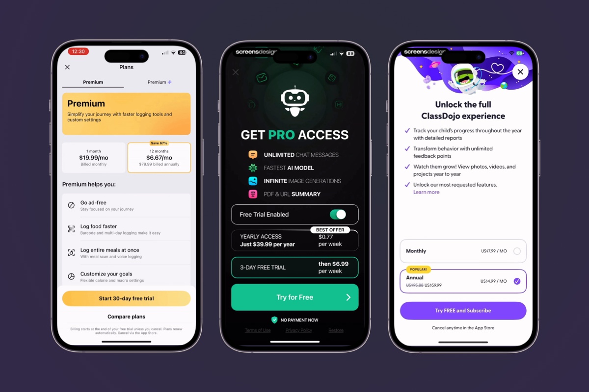
MyFitnessPal (Monthly Revenue: $13M | Monthly Installs: 1M): Uses an extensive, icon-rich list to clearly show the long stack of features users unlock with Premium.
ChatOn AI (Monthly Revenue: $5M | Monthly Installs: 1M): Stacks value with a short, powerful list of its most compelling features, emphasizing core benefits like "UNLIMITED CHAT MESSAGES."
ClassDojo (Monthly Revenue: $1.3M | Monthly Installs: 250k): Uses checkmarks and action-oriented language to stack the benefits for parents, such as "Track your child's progress."
Here's a closer look at MyFitnessPal's use of an icon list to promote features:
MyFitnessPal's feature list.
Potential Testing
A/B Test the Number of Benefits: Does a concise list of 3 benefits convert better than a comprehensive list of 6?
A/B Test Benefit Order: Test which benefit you list first. Does "Remove Ads" or "Unlock All Content" perform better as the leading hook?
A/B Test the Wording: Test different copy for the same benefit (e.g., "Offline Mode" vs. "Use Anywhere, Even Without WiFi").
Pattern 3: The social proof engine
Successful apps reduce purchase anxiety by showing that many other people trust and use their product.
The psychology
This is a direct application of Social Proof. When people are uncertain, they look to the actions of others to guide their own. If millions of people are paying for an app, it must be good and safe.
The strategy
Use specific numbers. "Join 5 million users" is more powerful than "Join our users."
Display star ratings. Showing a 4.8-star rating with "(140k Reviews)" adds a layer of objective proof.
Incorporate testimonials (optional but effective). A short quote from a happy customer can be very persuasive.
Apps using this pattern
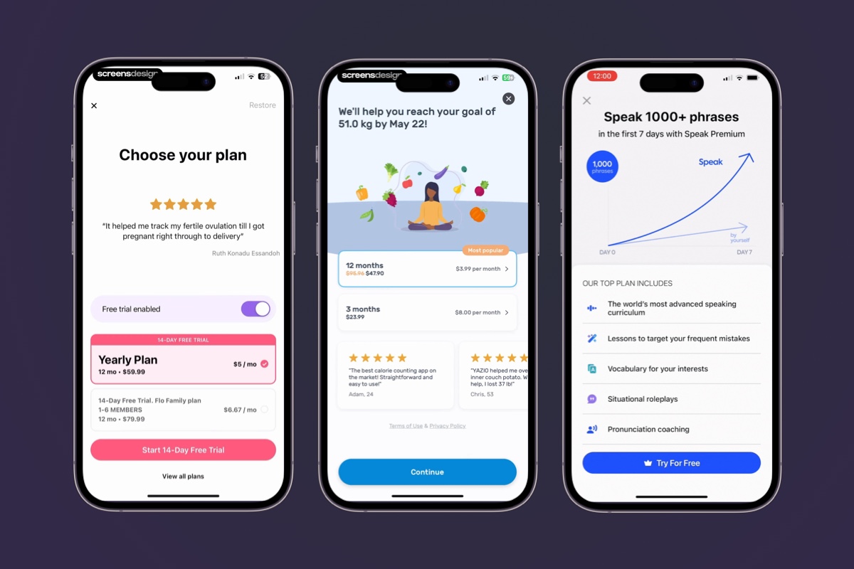
Flo (Monthly Revenue: $9M | Monthly Installs: 2.3M+): Builds trust by placing a relatable and powerful user testimonial directly on its paywall.
YAZIO (Monthly Revenue: $3.3M | Monthly Installs: 700k): Displays multiple user testimonials with star ratings beneath its main offer, reinforcing the value of the subscription.
Speak (Monthly Revenue: $2.8M | Monthly Installs: 650k): Combines multiple forms of social proof, boasting over 5 million users and showcasing a 4.8-star rating from over 140,000 reviews.
Let's take a closer look at Speak, who do a fantastic job of emphasizing their social proofs:
Speak's social proofs in action.
Potential Testing
A/B Test the Type of Proof: Test a user count ("Join 5M users") vs. a testimonial vs. a star rating.
A/B Test the Specificity: Test "Join millions of users" vs. "Join 5,432,187 users." Sometimes hyper-specificity can increase trust.
A/B Test the Placement: Does social proof work better above or below the call-to-action button?
Pattern 4: The soft commitment
This pattern focuses on removing risk from the user's mind by emphasizing the "free" and "cancellable" nature of the trial. The goal is to get the user to try, not to buy.
The psychology
This leverages Risk Reversal. The biggest friction point is the fear of being charged for something you don't like or forgetting to cancel. By explicitly stating "Free Trial," "Cancel anytime," and "We will remind you before the trial ends," this fear is neutralized.
The strategy
The CTA is "Start Free Trial," not "Subscribe." The language focuses on the immediate, free benefit.
Add reassuring microcopy. Small text near the CTA like "Cancel anytime" or "No commitment" is crucial.
Explain the terms clearly. Many top apps explicitly state when the trial ends and when the first payment will occur.
Apps using this pattern
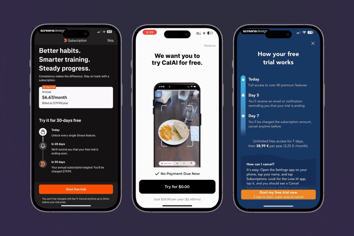
Strava (Monthly Revenue: $11M | Monthly Installs: 1.3M): Clearly outlines what happens on day 1, day 28, and day 30 of the trial, removing any uncertainty.
Cal AI (Monthly Revenue: $2M | Monthly Installs: 500k): Reassures users by prominently stating "No Payment Due Now" and promising to send a reminder before the trial ends.
Lose It! (Monthly Revenue: $3.3M | Monthly Installs: 350k): Dedicates its entire paywall to explaining "How your free trial works," explicitly detailing the timeline and cancellation process.
Looking at CalAI, you're reassured that what you're doing is starting a trial, not paying right now:
CalAI's copy helps reinforce what you're doing — starting a trial, not paying right now.
Potential testing
A/B Test the CTA: Test "Start Free Trial" vs. "Try for Free" vs. "Start My 7-Day Trial."
A/B Test the Reassurance Copy: Test including vs. excluding the "Cancel anytime" text. Or test different versions like "Easy cancellation" vs. "No commitment."
A/B Test the Trial Length: Test a 3-day trial for one group and a 7-day trial for another to see which leads to higher long-term conversion.
Pattern 5: The "now-or-never" offer
This pattern creates a sense of urgency to push users past the "I'll decide later" mindset. By making the offer feel scarce or time-sensitive, it encourages an immediate decision.
The psychology
This taps directly into FOMO (Fear Of Missing Out) and Loss Aversion. People are often more motivated by the fear of losing a great deal than by the prospect of gaining something. A limited-time offer makes the discount feel valuable and scarce, forcing a choice.
The strategy
Use huge, high-contrast discount banners. The offer isn't a footnote; it's often the most prominent visual on the screen (e.g., "75% OFF!").
Incorporate time-sensitive language. Phrases like "Offer Ends Today," "Special Launch Offer," or even a live countdown timer create pressure to act now.
Frame it as an exception. The offer is presented as a special event, not the standard price, making the user feel like they are getting a unique opportunity.
Apps using this pattern
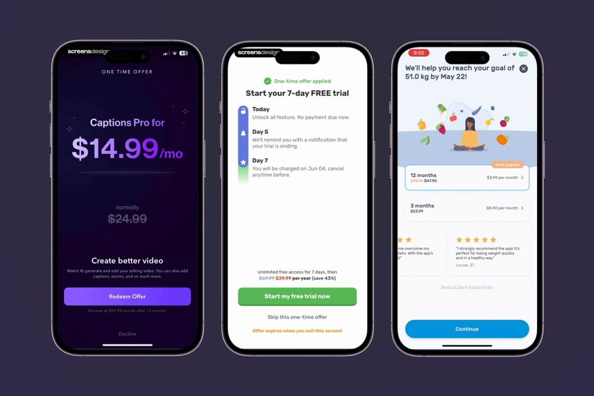
Captions (Monthly Revenue: $2.3M | Monthly Installs: 250k): Frames its discount as a "ONE TIME OFFER," creating immediate pressure for the user to decide before they lose the special pricing.
Finch (Monthly Revenue: $1.8M | Monthly Installs: 650k): Creates strong urgency by explicitly stating "Offer expires when you exit this screen!" at the bottom of its paywall.
YAZIO (Monthly Revenue: $3.3M | Monthly Installs: 700k): Uses gamified urgency, offering a "spin" for a "One-Time Offer" with a large "75% OFF FOREVER" banner.
Yazio is wonderful example of this, the "spin the wheel" approach drives in the nature of the offer. It's here right now, and if you don't act on it — it's gone:
Yazio's spin the wheel offer.
Potential testing
A/B Test the Offer Itself: Run a test showing 50% of users your standard paywall and 50% the same paywall but with a "40% Off – First Year Only" banner.
A/B Test the Discount Amount: Does a massive but less believable "90% Off" convert better than a more modest and trustworthy "50% Off"?
A/B Test the Urgency Type: Test simple text ("Offer Ends Today") against a live countdown timer to see which creates more pressure and drives more conversions.
While creating urgency is a potent strategy, it's the one pattern that carries a slight risk of feeling aggressive to users if not handled with care. The key is to ensure the offer provides genuine, exceptional value. When the user feels they are getting a truly special deal, the urgency feels like a helpful nudge rather than a high-pressure sales tactic.
Wrapping up
The most successful app paywalls are never an afterthought; they are a carefully crafted blend of user psychology, compelling design, and strategic value presentation.
While the five patterns we've explored are powerful on their own, the real magic often lies in how they are combined to create a seamless and persuasive user experience.
The ultimate lesson is to test everything. Use these proven patterns as your starting point, but listen to your users and your data. By continuously testing and iterating, you can transform your paywall from a simple gatekeeper into a powerful gateway for sustainable revenue.
If you want to get inspired, check out ScreensDesigns for more patterns.